NOMS
Noms is a cooking app two classmates and I created as a group assignment from Scott Klemmer's COGS120/CSE170 course in the winter of 2019. The app aims to alleviate the confusion of adapting recipes for home cooks with dietary restrictions.

By replacing ingredients based on the user's dietary restrictions, Noms helps users search for meals, find replacements, and adapt recipes at the press of a button.
SKILLS LEARNED...
HTML/CSS
JSON
AJAX
Bootstrap
Usability Heuristics
A/B User Testing
Data Analytics
(Chi-Square Testing, Google Analytics)
Facebook for Developers
Elevator Pitching
App Presentation
VIEW CODE HERE...

Design Process
Need Finding
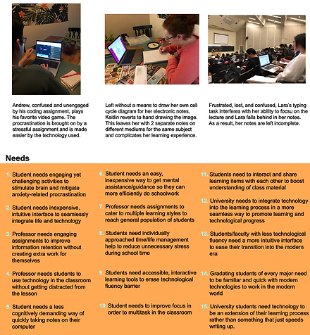
Our first assignment was to conduct individual need finding studies and write a point of view on the need(s) we found. I did mine on three college students with different majors doing their schoolwork.

Story Boarding
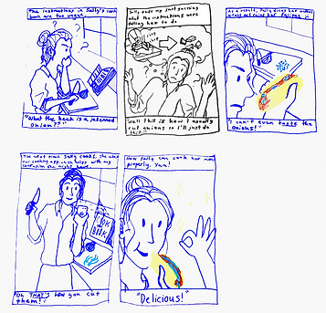
Once we settled on the need for a less stressful cooking experience, we began storyboarding needs that different consumers might have.


Prototyping
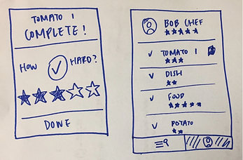
We were told to make two different paper prototypes of what our app would look and function like. Initially, we were playing around with the idea of having a social pantry feature, but this idea was eventually scrapped after advice from our professor.
Prototype 1


Prototype 2

Wireframing & Skeleton
We were then told to take the best parts of our designs and make some wireframes. During this process, our app went through many redesigns until we decided on what was best to put in our wireframe.


We used our wireframe to create a basic skeleton of our app that we would built upon over the rest of the quarter.

The skeleton after adding a little more css, heading into the working prototype phase.
Working Prototype
Over the next couple weeks, we made our first functioning prototype of our application.


User Testing & Results
We then conducted user tests based on two different home pages that we created -- one with a single column layout an a search bar, and another with a three column layout and different filters for dietary restriction, difficulty, and personal preference. We tested for the speed at which people found their recipes, to decide which homepage was easier for users to interact with. We also observed any difficulties our participants had with other parts of the app to try to improve them.
Homepage A


Homepage B


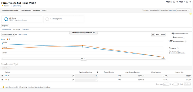
Graphical representation of the results of our A/B user testing.
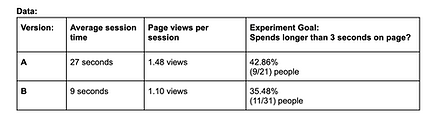
After conducting our user tests with google analytics, we used the data to do a chi-square statistical analysis of our results.

Formal qualitative data
Chi squared testing expectations vs. results
The results of the chi-square analysis ended up not being statistically significant (most likely because we didn't have a large enough data pool) but we did notice that people tended to click on recipes faster with the grid layout. One piece of informal feedback we frequently got from participants using version B was that they were looking for some sort of text-input search system. We used this data to influence our design choices for the final version of the app.
Final Product
We took all the feedback, heuristic evaluations, and user data we had gathered during the research and development phase of the process into account when making our final design decisions.
We modified the sign up process so that it was easier to read and less confusing. We also added a tutorial after signing up to help new users get familiar with the app.


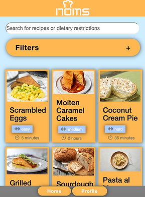
For the home page, we kept the three column layout with the filters, but we added a search bar to allow each user to search for recipes in a way that is intuitive to them.

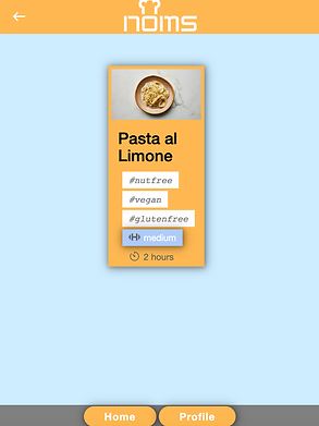
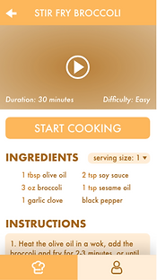
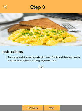
Changing the available dietary restrictions on any recipe immediately changes the ingredients and instructions to make the recipe conform with the user's personal diet needs.


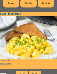
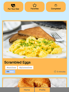
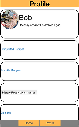
Users can easily access their favorite recipes and ones they have recently completed from the profile page. They can also change their restriction at any time by clicking or tapping on the dietary restriction menu.