MS Power BI for KP
A Style Guide Developed for Kaiser Permanente in 2019
_PNG.png)
Overview

In the summer of 2019, I was hired as an undergraduate intern at Kaiser Permanente to create a financial report style guide for their data analytics department. The guide aimed to consolidate the style and format of these financial reports, which differed throughout the department. Another focus was on accessibility, designing color palettes to meet the needs of colorblind individuals. By the end of my internship, I created an extensive style guide detailing my research and design solutions that addressed the needs of the client.
Design Process
User Research
When I arrived at my internship, I immediately interviewed different stakeholders on my team to discover breakdowns in the current flow of report creation. I discovered the following points of friction:
Color Palette Issues
-
Many of the data colors used to represent different categories are too similar, they are hard to tell apart and talk about in a meeting
-
Because of a lack of standardized color palette, many data color choices look identical to employees with colorblindness
Issues from Lack of Standardization
-
Creating financial reports is a source of anxiety for some analysts, because they are unsure of what the company standard is
-
Analysts are unsure which type of graph is the best to visualize their data, so they often use the same kinds of graphs in every report
-
Analysts don’t know the best way to lay out visualized data to create a data story
-
Some stakeholders feel frustration when an analyst chooses to use a text size that is too small for them to read easily
Problem Statement
The financial reports coming out of the KP Data analytics department feature a wide range of design styles. The reports the analysts create make it harder to convey the data story to clients because analysts left to their own devices are using the wrong font sizes, colors, and graph types for their data. Data analysts at Kaiser Permanente need a style guide to clarify the design choices they should be making when they create a financial report in Microsoft PowerBI.
User Personas
David
Data analyst making financial report
-
David’s least favorite part of his job is creating data reports on Microsoft Power BI.
-
David is unsure how to start creating his reports, he doesn’t know what kind of format his boss is expecting. This causes him anxiety when he makes his reports.
-
When he is choosing colors for his graphs, David just picks colors that he likes. He doesn’t realize that when he chooses red, his data is misinterpreted as a revenue loss.
Ramona
Department head presenting fin reports to executives
-
Martha tries to single out one data category, but color is too light to differentiate it from other categories in data select mode
-
Causes a break in her presentation flow, leading to frustration
-
-
Reports contain too many number tables, hard for Martha to show the data story that helps execs make decisions
Ed
Manager going over team’s monthly reports with regional directors
-
Because of his colorblindness, certain categories of data often look the same
-
The data story literally looks different to Ed (ex: 2 separate pieces of data will look like a big chunk of the pie chart)
-
-
Data categories with the same color coupled with a lack of labels creates frustration for Ed when he tries to talk about the reports to his directors
-
Ed feels frustrated when he has trouble reading his team’s reports because the text size is too small for him to read easily
Market Research & Observations
As the next step in my design process, I researched both MS Power BI report examples and data communication best practices. The major takeaways from my data communication research were as follows:
Data & Color
-
Categorical data
-
Use distinct colors
-
-
Sequential data
-
Use sequential colors
-
Darker colors indicate higher values, also newer data
-
Lighter colors indicate lower values, also older data
-
-
-
Color Consistency
-
Use the same colors to represent the same metrics across different graphs
-
-
Good Contrast
-
Use contrast to draw attention to important data, also helps to make your graphs easier to read
-
Report Format
-
Anything that influences a graph should go to the left of the graph it influences
-
Place most important information at the top
-
Use graphs whenever possible, they communicate more than spreadsheets
Prototype Sketches
I made some prototype sketches for the format of the new report pages. I took inspiration from the headings and organizational systems in my market research.
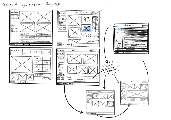
After surveying the analysts, I learned that each user created multiple different kinds of financial reports, each serving a unique purpose. I decided that the design with the navigation panel and the title section was the most flexible for various purposes.

The prototype keeps the title section and the navigation consistent (relevant to the available data) and allows the client to navigate seamlessly through all pages and datasets.
Color Palette
As part of my redesign, I was asked to create a new color palette to be used specifically for MS PowerBI. The palette needed to meet these requirements:
-
Accessible to colorblind individuals
-
Good contrast when using data selection mode in Power BI
-
Discourage analysts from using the color red (only for really negative data)
-
In line with existing KP branding
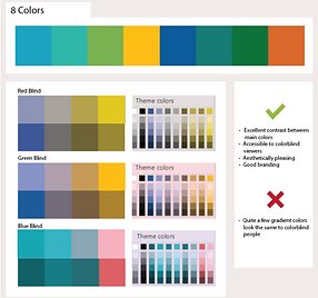
I looked to the current KP color palette for inspiration, but found myself unhappy with the shades that they were using. The colors that fit my requirements did not perform well when tested for colorblindness. The existing KP color palette was not designed to be used in MS PowerBI, where the colors would often be interacting with each other.
For this color palette, it was important that each color had good contrast not only while in data selection mode, but also while being used against each of the colors in the palette. Ensuring the colors had a large enough difference in contrast would also help colorblind people tell different colors apart.
KP's Official color palette, tested for accessibility. X's indicate colors that are too similar to be told apart, or colors that do not contrast well with another color in the palette.

I conducted more research into KP’s branding, and found an older color palette that had been developed for print media. The colors in this older palette were much brighter, more vibrant, and full of life than the current KP palette.

Janet Guertin's KP color palette for printed materials.
I decided to use colors from the older palette, but when I subjected them to the same color blindness testing, many of the shades still fell short. After making a few adjustments, I ended up with the final palette.

Final color palette, adjusted for best contrast between colors.
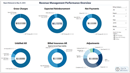
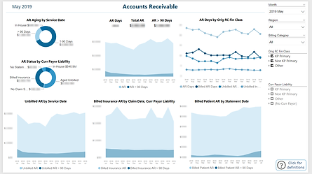
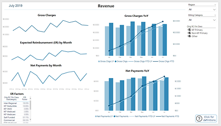
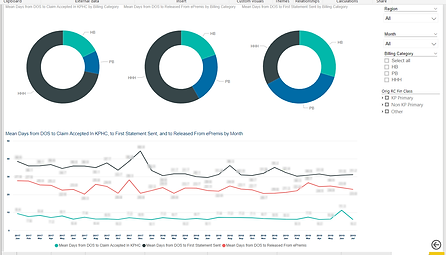
Report Redesign
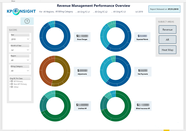
To help me make specific design decisions for the style guide (such as font size, page size, specific settings, etc.), I worked with an analyst to redesign an existing report using the knowledge I had gained from my market research.
The major changes I implemented were adding an overview dashboard, putting all slicers in a slicer menu to the left of the graphs they influenced, adding a navigation bar to the right of the introductory report dashboard, and making all titles/tables consistent across the report. We also used the opportunity to implement and test the color palette I created.

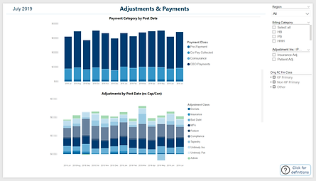
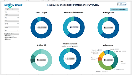
Dashboard page added to summarize report.
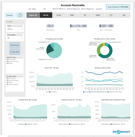
Original
Redesign


Style Guide
From this final prototype, I documented my final design decisions in the style guide. My supervisor also worked on the guide, providing definitions of visualizations that would resonate with analysts as well as user feedback on the rest of the guide. Together, we completed the Kaiser Permanente Power BI Style Guide


User Testing -- From Prototype to Final
After creating my deliverables, I implemented a user testing phase. I gave the redesigned report and the new style guide to the analysts at KP to highlight and solve any issues in my designs. Some of the pain points my users discovered were:
Problem
Some terms in the guidelines were unfamiliar to the user, users were unsure when to use certain settings over others.
Solution
Added slides explaining the purpose of major settings and proper use with examples.

Problem
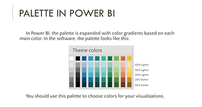
The user was confused when some guidelines asked for them to use a percentage of a color in the color palette (ex. 10% darker white)
Solution
Added a slide showing the palette as it appears in Power BI and included percentages for user reference.
Problem
The user pointed out that the guide was really long, and they were unlikely to read through the whole thing to look up one setting.
Solution
Used JSON to create an importable style sheet for analysts so that most of their work would be formatted by default, making it so users would only need to consult the guide for clarification and special cases.
Reflection
My internship at Kaiser Permanente taught me more about data communication and the process of UI/UX design. Over 10 weeks at KP, I conducted both field and user research, sketched wireframes, prototyped, tested, problem-solved, and worked with analysts to produce materials to guide them in formatting their reports.